ARKO STUDIO
45.5365° N — 10.2142° E
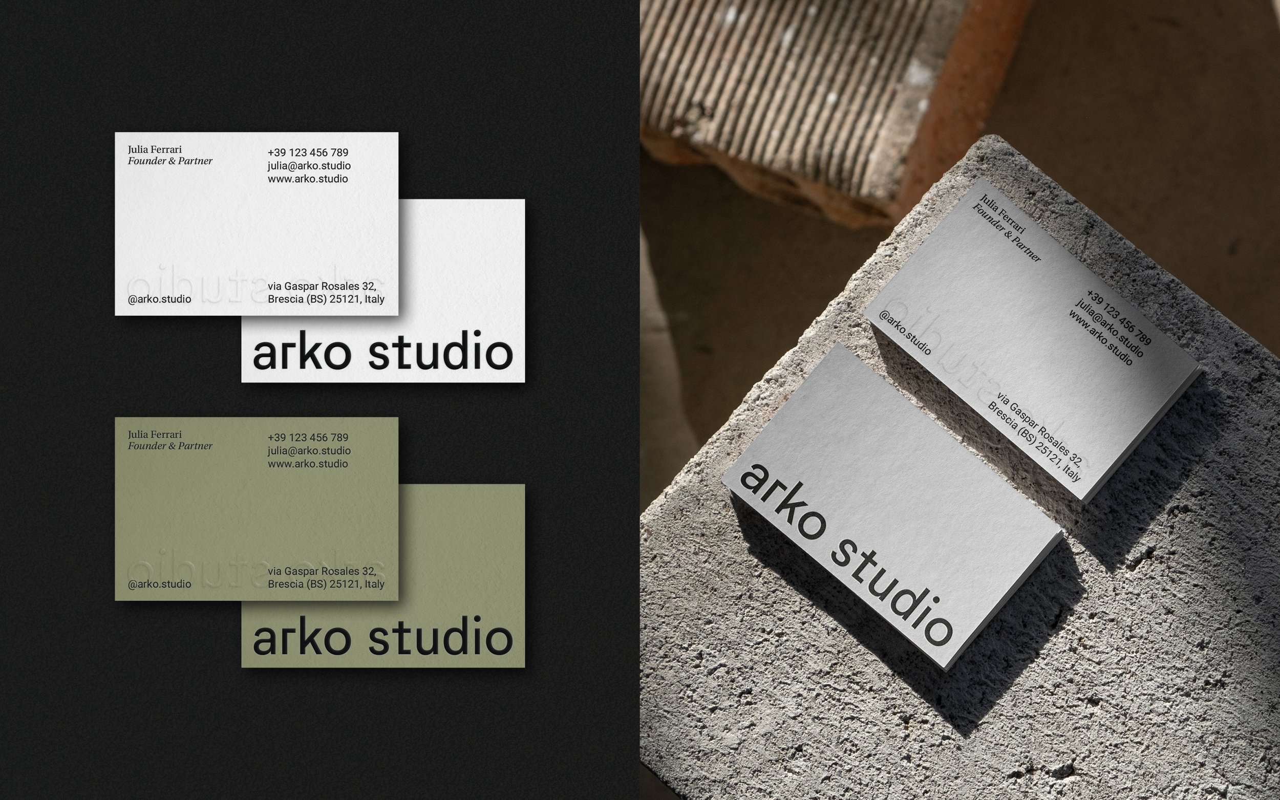
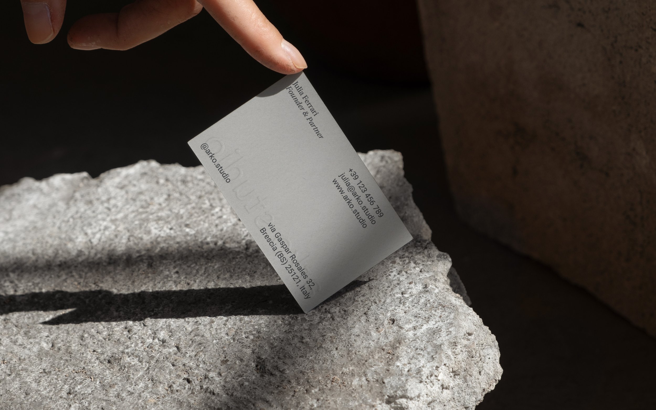
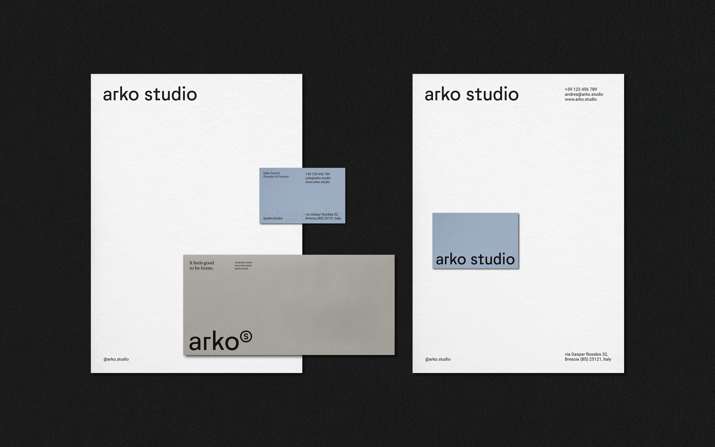
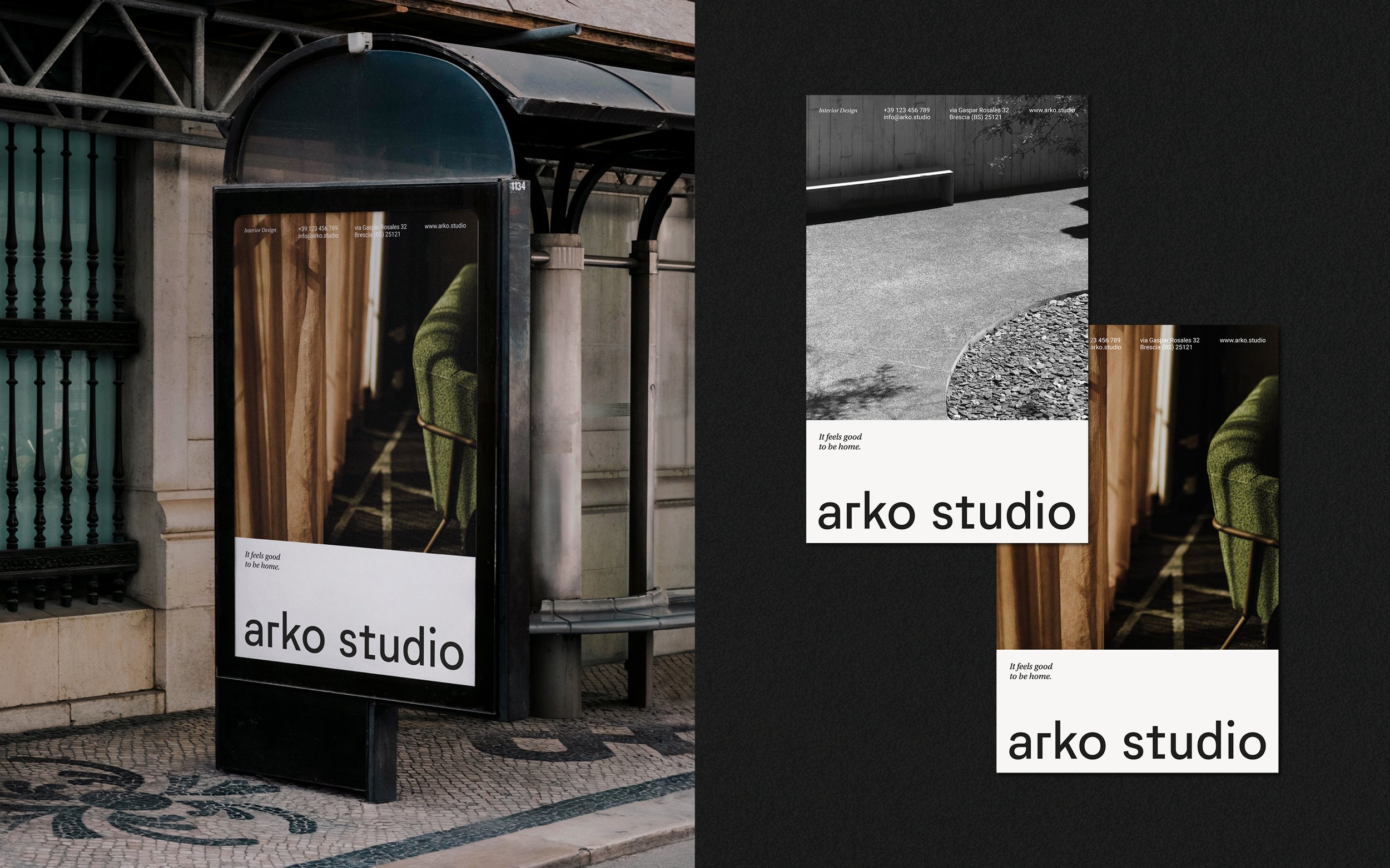
Brand naming and visual identity, uniting design passion with global accessibility, and strong architectural symbolism.
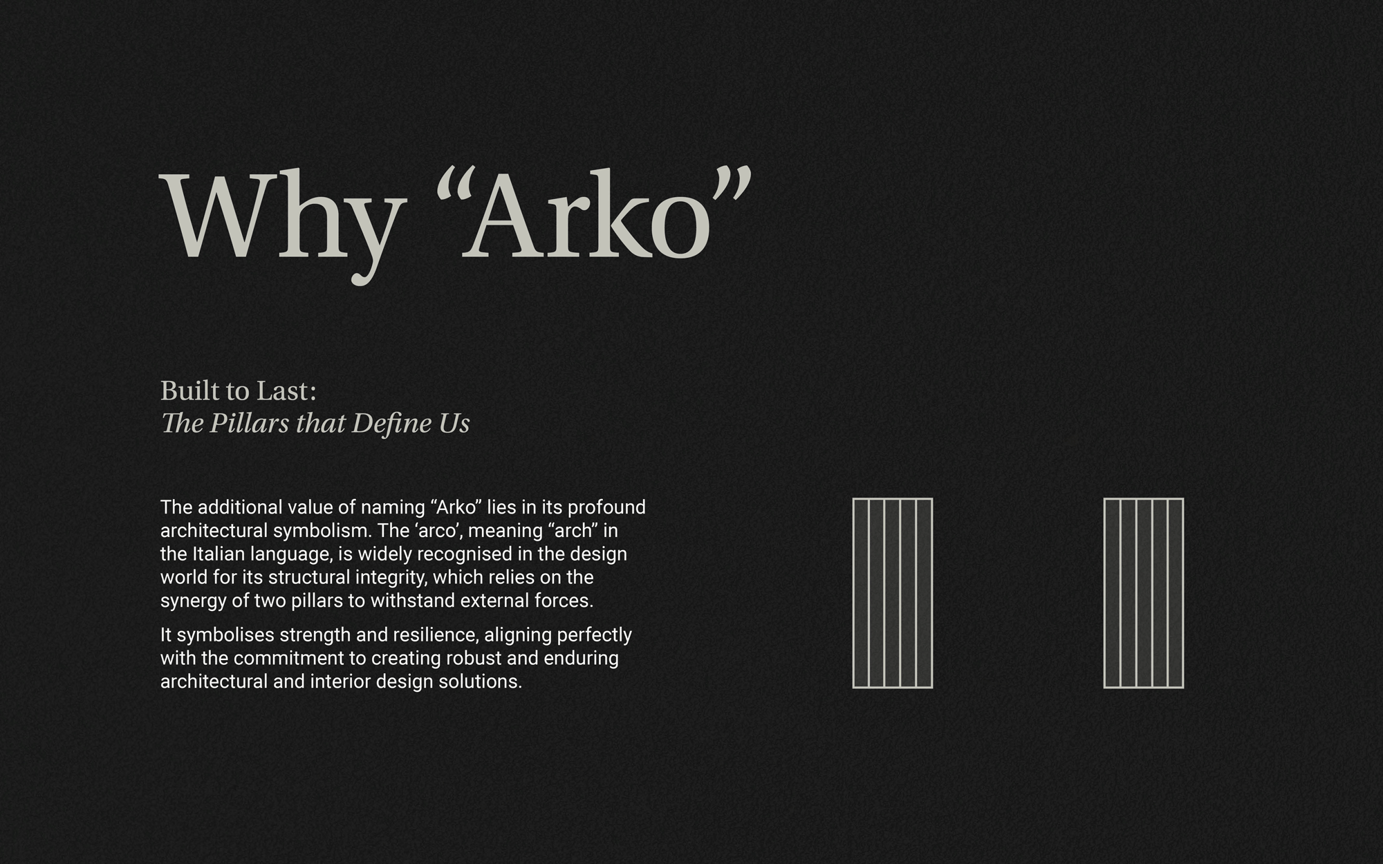
Arko is an interior design office based in northern Italy, operating on an international scale. Founded by a couple sharing a strong passion for design, the office’s core values are synergy, chemistry, and duality. The name Arko was carefully chosen from hundreds of options for its intrinsic value, and originally derives from the combination of 'architecture' and 'collaboration.' The name Arko transcends linguistic boundaries, making it a unique choice for a brand identity. It's easily pronounceable in both Italian and English, resonating with elegance and simplicity in each language. This bilingual fluency enhances their global appeal and underscores the commitment to accessibility and inclusiveness, allowing to connect with a diverse clientele.
Brand naming, visual identity
SERVICE: